Project 2: Fun with Filters and Frequencies!
Part 1: Fun with Filters
1.1 Convolutions from Scratch!
    def convolution_four_loops(img, kernel):
        output_img = np.zeros(img.shape)
        h, w = img.shape
        m, n = kernel.shape
        center_m = m // 2
        center_n = n // 2

        for i in range(h):
            for j in range(w):
                for a in range(m):
                    for b in range(n):
                        x = i - (center_m - a)
                        y = j - (center_n - b)
                        if 0 <= x < h and 0 <= y < w:
                            output_img[i, j] += kernel[m - 1 - a, n - 1 - b] * img[x, y]

        # Apply min-max normalization so convolution doesn't get blow up
        norm_img = (output_img - output_img.min()) / (output_img.max() - output_img.min())
        return norm_img
  def convolution_two_loops(img, kernel):
    output_img = np.zeros(img.shape)
    h, w = img.shape
    m, n = kernel.shape
    center_m = m // 2
    center_n = n // 2

    kernel_flipped = np.flipud(np.fliplr(kernel))

    for i in range(h):
        for j in range(w):
            x_start, x_end = i - center_m, i + m - center_m
            y_start, y_end = j - center_n, j + n - center_n

            patch = img[max(0, x_start) : min(x_end, h), max(0, y_start) : min(y_end, w)]
            kernel_patch = kernel_flipped[max(0, -x_start) : m - max(0, x_end - h),
                                      max(0, -y_start) : n - max(0, y_end - w)]
            output_img[i, j] = np.sum(patch * kernel_patch)

     # Apply min-max normalization so convolution doesn't get blow up
    norm_img = (output_img - output_img.min()) / (output_img.max() - output_img.min())
    return norm_img
Convolving with a 9 x 9 box filter:
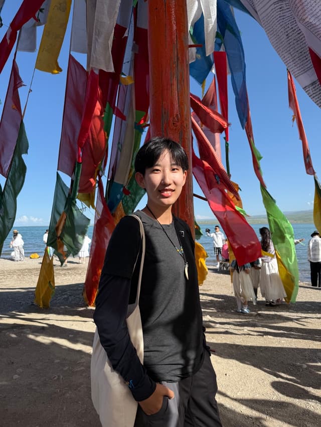
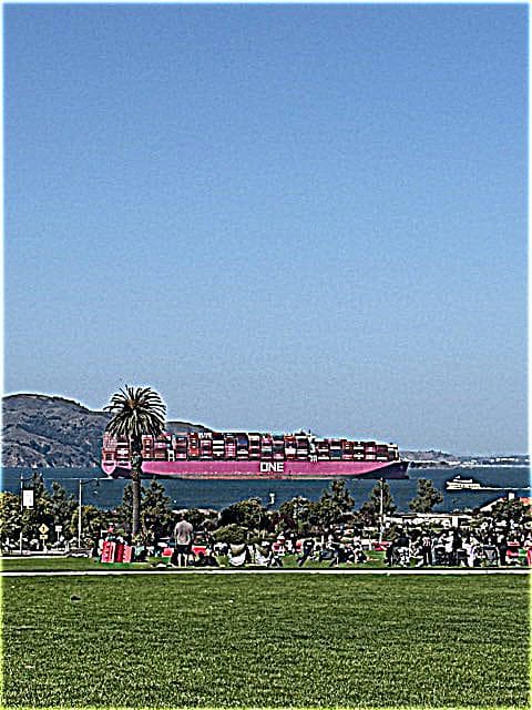
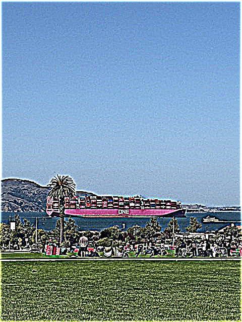
Original image of me, RGB

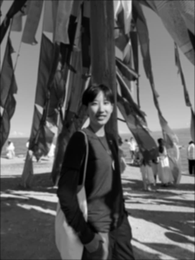
Four-loop convolution, grayscale
Runtime: 30.5518s

Two-loop convolution, grayscale
Runtime: 2.8947s
scipy.signal.convolve2d(), grayscale
Runtime: 0.1709s
The four-loop convolution implementation is incredibly slow, because we are looping through each pixle in the numpy array, instead of using matrix operations. By using matrix operations with the two-loop method, the runtime of the convolution is significantly faster. The scipy method is the fastest, since scipy leverages efficient Fourier Transfrom algorithms for larger arrays (complexity O(NlogN) instead of O(n^2) for direct convolution), and relies on highly optimized low-level code for all operations.
Handling boundaries: When convolving with the 9 x 9 box filter, I applied zero-padding to all the functions above(four-loop, two-loop, and scipy.signal.convolve2d()). This means that the function assumes values outside the image are a constant value of 0. For example, if we were convolving using the box filter with the left most pixel, this function would assume that for the 9 x 9 kernel, all pixels to the left and top of the leftmost pixel (out of the input image boundaries) would have value 0 when convoling. When calling scipy.signal.convolve2d(), I used mode = 'same', with the default (boundary='fill', fillvalue=0). This means that the output is cropped/padded so it matches the size of input image. Four-loop and two-loop are both implemented with mode = 'same' as well.

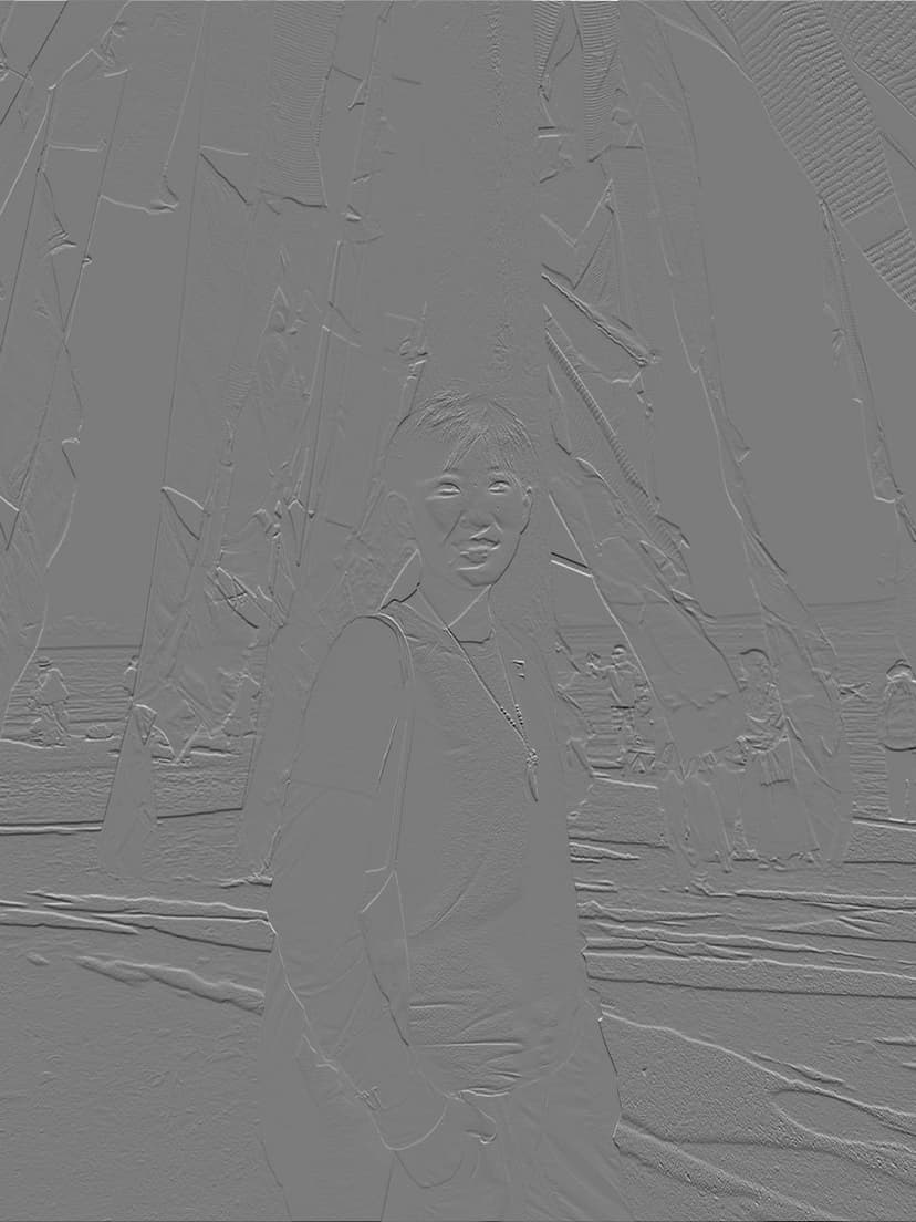
Dx with four-loop convolution, grayscale
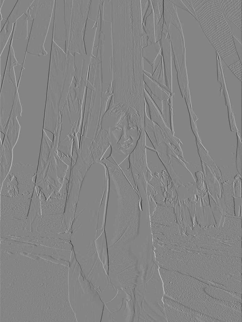
Dx with two-loop convolution, grayscale

Dx with scipy.signal.convolve2d(), grayscale

Dy with four-loop convolution, grayscale
Dy with two-loop convolution, grayscale
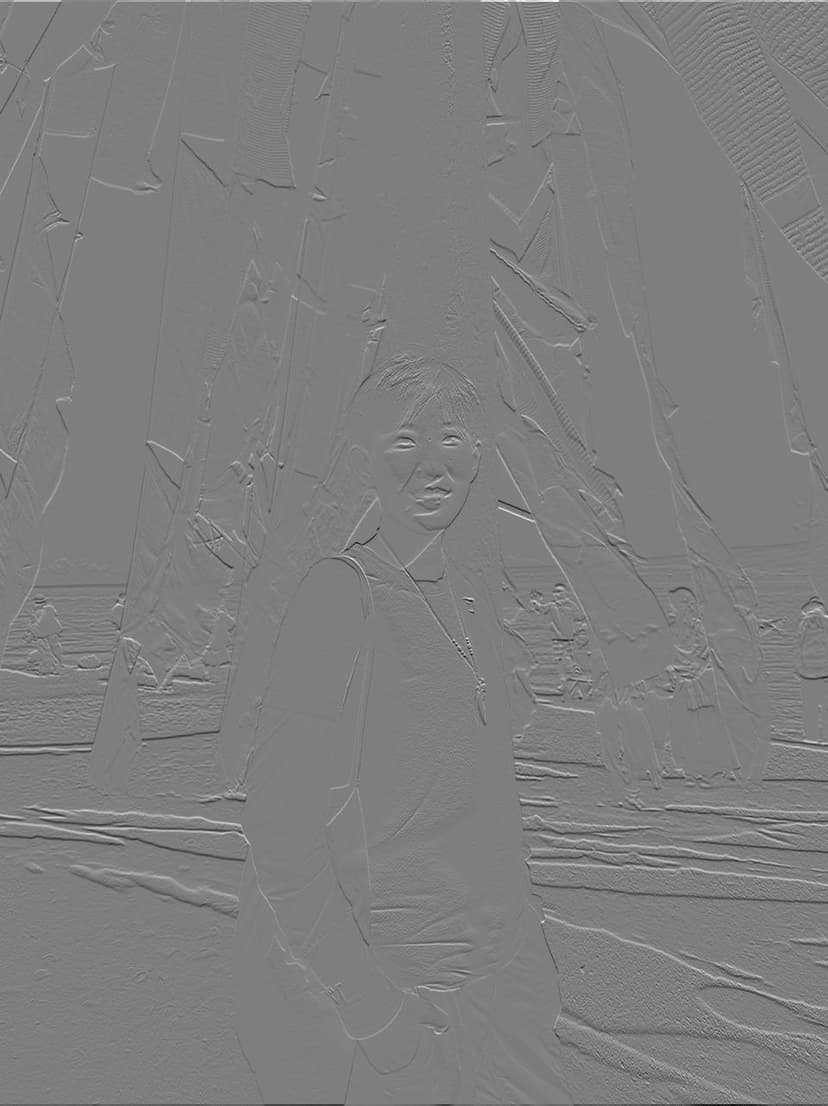
Dy with scipy.signal.convolve2d(), grayscale
I ran the derivative filters with the four-loop, two-loop, and the scipy convolution functions. The results for D_x and D_y are the same visually for all the three functions.
Notice that the images filtered with the D_x filter exhibit very pronounced vertical edges, while those filtered with D_y show clear horizontal edges. This is because the filters are essentially derivative filters, where D_x computes the difference along the horizontal direction (columns), highlighting vertical changes in intensity, whereas D_y computes differences along the vertical direction (rows), emphasizing horizontal changes.
1.2: Finite Difference Operator
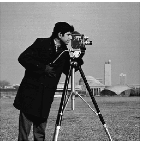
Cameraman, original
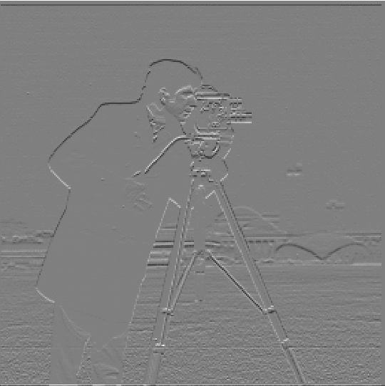
Convolved with Dx
Convolved with Dy
The gradient points in the direction of most rapid increase in intensity:
And the edge strength is given by the gradient magnitude:
With this, we can easily derived the gradient magnitude image using the two partial derivative images. Below (Fig 1.2.1) is the normalized gradient magnitude image. But to turn this into an edge image, we'd need to binarize the image. After some experiments and quanlitative evaluations on the visual effect, I chose
to remove all the noise. This means that I set any pixle value (in a [0, 1,0] scale) below 0.65 to 0, and any pixel brighter than the threshold to 1. See Fig 1.2.2 for the binarized edge image of the cameraman.
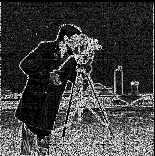
Fig 1.2.1 Gradient magnitude
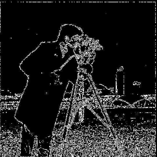
Fig 1.2.2 Binarized gradient magnitude
We could see from the above image that the resulting convolution with finite difference operators are still very noisy. I couldn't find a good threshold to exclude the grassland but included the edges from the back of the image.
1.3 Derivative of Gaussian (DoG) Filter

Cameraman, original
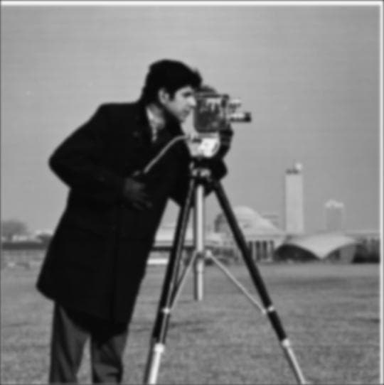
Fig 1.3.1 Gaussian blurred
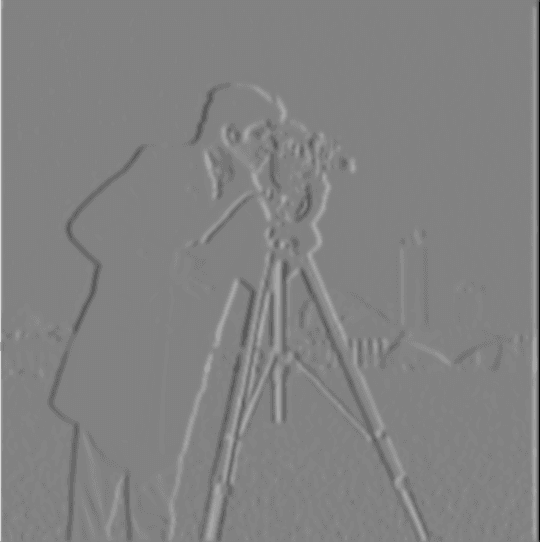
Fig 1.3.2 Convolved with Dx
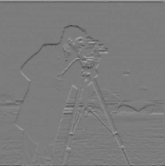
Fig 1.3.3 Convolved with Dy
threshold = 0.080 in pixel intensity scale [0.0, 1.0]
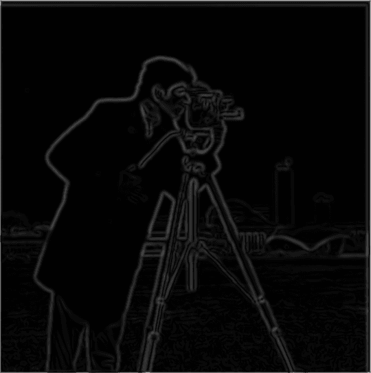
Fig 1.3.4 Gradient magnitude
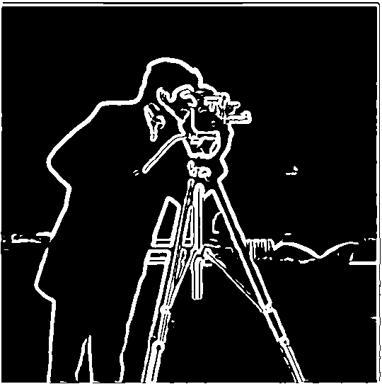
Fig 1.3.5 Binarized gradient magnitude
Next, I applied a single convolution, instead of two, by creating a derivative of gaussian filters. I first convolved the gaussian blurring effect G with D_x and D_y, and then applied G(D_x) and G(D_y) to the original image.

Fig 1.3.6 G(D_x): Gaussian smoothed D_x

Fig 1.3.7 G(D_y): Gaussian smoothed D_y
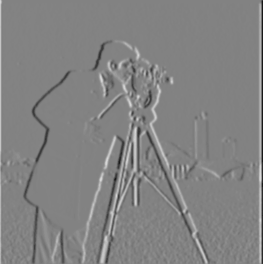
Fig 1.3.8 Convolved with G(D_x)
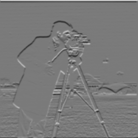
Fig 1.3.9 Convolved with G(D_y)
To generate the binarized edge image, I chose a threshold of 0.080 in pixel intensity range [0.0, 1.0].
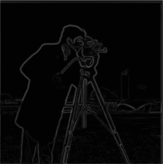
Fig 1.3.10 Gradient magnitude

Fig 1.3.11 Binarized gradient magnitude
With a side-by-side comparison, we could see that the two procedures yield the same edge image.
Fig 1.3.5 Binarized gradient magnitude
Fig 1.3.11 Binarized gradient magnitude
Comparing with the finite differiate operators, the edges in the convolutions here are very clear with little noise. The gaussian smoothing helped us get rid of the noise, and also helped make the edges thicker than Part 1.2 with finite difference operators.
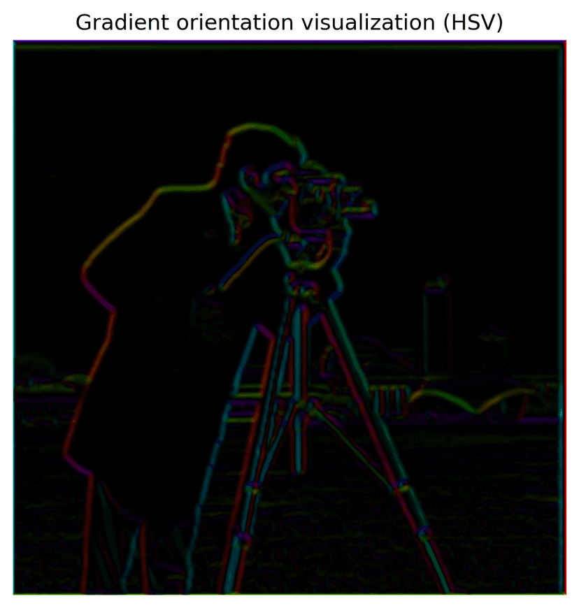
1.4: Bells & Whistles: Visualize image gradient orientations in HSV
To visualize gradient orientation, I first compute the gradient orientation using the two partial derivative images produced above, following the function:
This orientation is then mapped to the hue channel in HSV space, normalized to [0,1]. The saturation is fixed at 1, while the value channel encodes the gradient magnitude (after normalization). Finally, the HSV image is converted to RGB for display using matplotlib.colors.hsv_to_rgb(). The color means edge direction, and intensity represents edge magnitude in this visualization.
Part 2: Fun with Frequencies!
2.1 Image Sharpening
To implement the unsharp filter, first I created a 2D gaussian-blurred image, with kernel sigma = 6 and ksize = 13. This would serve as the "base" image for the unsharpening process.
To obtain the high frequency image of the original image, a laplacian image is generated, by substracting the gaussian-smoothed image from the original image.
We stack the two images generated above on top of each other, with a sharpening factor alpha applied to the laplacian image, and clip out pixel values outside of the range [0.0, 1.0] to get the final sharpened image, using the unsharp mask filter.
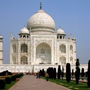
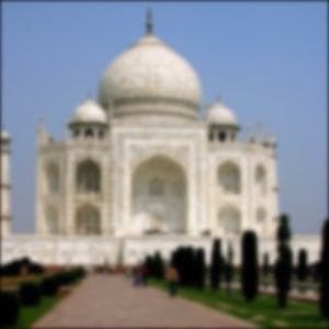
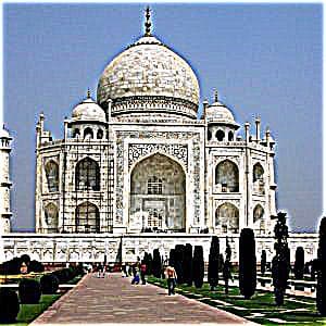
Original image of Taj Mahal
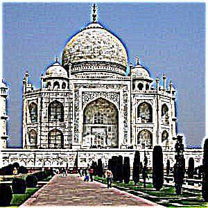
Gaussian blurred, sigma = 2
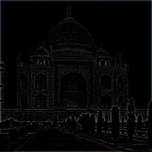
Laplacian image
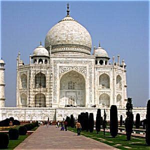
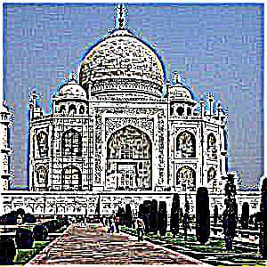
Sharpened image, alpha = 1
I also experimented with different alpha values, to see which one brings the best sharpening effect. Here's a comparison of alpha = 1, 3, 5, 10, and we could observe that the edges of the building becomes increasingly sharpened as alpha increases. But also, the noise becomes more obvious too as alpha goes up, especially in the sky.
Sharpened image, alpha = 1
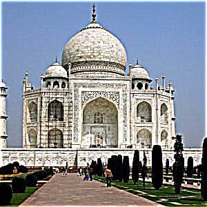
Sharpened image, alpha = 3
Sharpened image, alpha = 5
Sharpened image, alpha = 10
I picked the alpha = 5 sharpened image, and re-sharpened it with alpha = 5 again. From the comparison below, we could see that the image with two round of sharpening has the most defined edges, comparing to alpha = 5 (original) or 10. The resharpened image also has a lot more noise than any of the other lower alpha levels. This occurs because re-sharpening amplifies the higher-frequency components that were already enhanced in the first pass.
Sharpened image, alpha = 5
Sharpened image, alpha = 10
Resharpened image, applied alpha = 5 twice
I also applied the unsharp mask filter process to sharpen a photo I took in the Presidio, San Francisco.
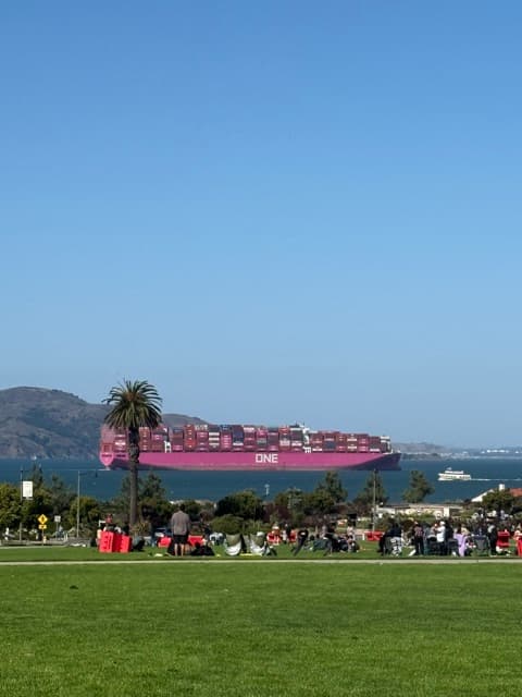
Original image of the Presidio, SF
Gaussian blurred, sigma = 2
Laplacian image
Sharpened image, alpha = 1
We could see that the above observation on how alpha value impacts the intensity of the object edges and the image noise hold true in the following comparison.
Sharpened image, alpha = 1
Sharpened image, alpha = 3
Sharpened image, alpha = 5
Sharpened image, alpha = 10
2.2 Hybrid Images
Test run with Derek and Nutmeg. To create visually appealing hybrid images, I started with tuning the provided starter code with the provided headshots of Derek and Nutmeg, to ensure the best visual effects. I set Derek as the low frequency image, and Nutmeg as the high frequency image here, and aligned them by their eyes. One would see Nutmeg if seeing the hybrid image up close, and Derek from further away.
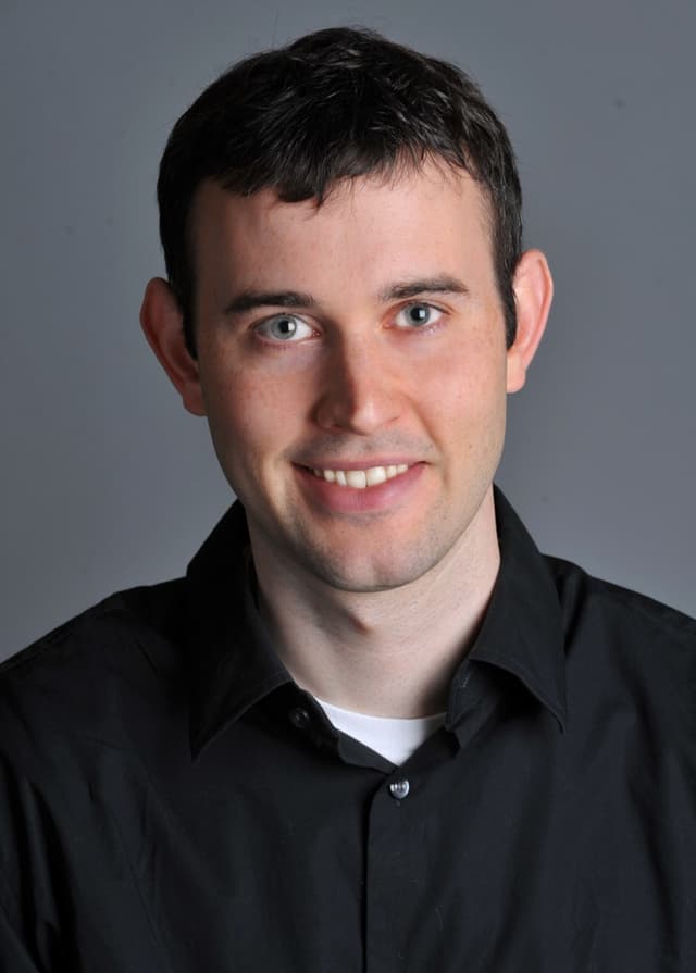
Derek
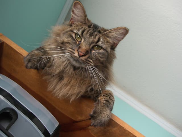
Nutmeg
Hybrid image of Derek (low freq) and Nutmeg (high freq)
A detailed process. Here is a detailed process to create a RBG-colored hybrid image, using a headshot of my aunt and I as an example.
1. Align two images: To start, we pick two points in each images to align the two, using rotate, recenter, rescale, and other helpfer functions. In this case, I chose to align the two images by our eyes. See below for the aligned images generated from the original ones.
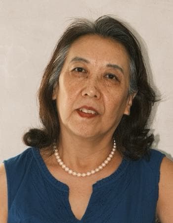
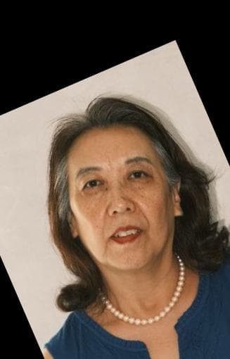
Headshot of my aunt
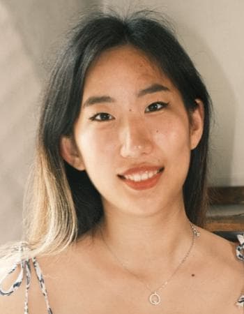
Headshot of myself
Aunt, aligned
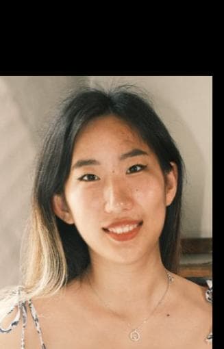
Me, aligned
2. Create high and low frequncy images: After the two images are aligned and rescaled, I start the hybrid process. We would need to generate a low and high frequency image for the hybrid result. I chose to use my aunt's headshot as the high frequency image, and my own headshot as the lower frequency one. I played around with the gaussian blur sigma value and kernal sizes, to ensure the best visual effect. For this process, I found that the following parameters work the best:
I notice that as sigma increases, the kernel size also increases, more pixels getting averaged in the process, leading to a wider range of higher frequencies being captured in the laplacian image. Therefore, I deliberately chose a relatively small sigma for the high frequency image, to make the high frequency image at just the right cutoff range so that visually it is not overshadowing the lower frequency image.
Using this, we can then generate the gaussian-smoothed low frequency image of myself, and the laplacian image (high frequency) of my aunt.
Aunt (high frequency), laplacian filter
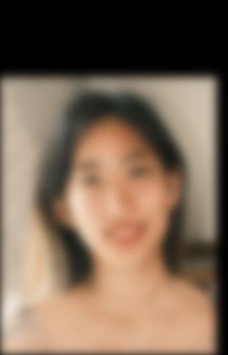
Me (low frequency), guassian blurred
3. Stack 'em together: We could either get the average of the two images, or just simply add them. I chose to stack the low and high frequency images by adding. Since we are using floats here, I clipped the pixel intensity to [0, 1] to avoid overflows. Apply some cropping, and there we have it – an RGB-colored hybrid image of my aunt and I:
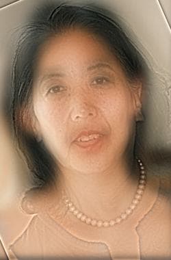
Hybrid image of myself (low freq) and my aunt (high freq)
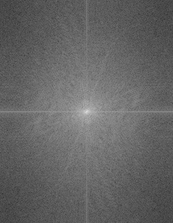
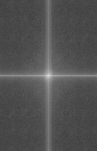
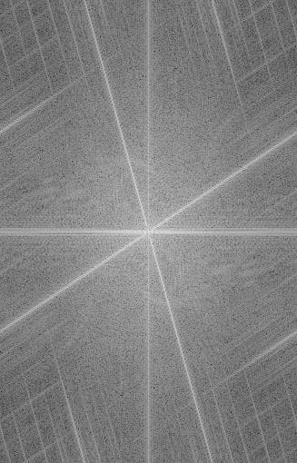
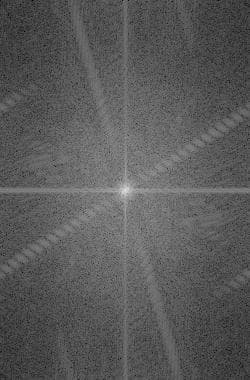
Log Fourier Transform analysis: Here are the log Fourier transform images of all the images above (in grayscale). We could see that the log Fourier transformed for the high frequency image has a lot more edges, and the log Fourier transform of the hybrid image seems to be the same pattern as the high and low frequency's log Fourier transform added combined. Why is this the case?
A hybrid image is composed of a low-frequency component (Gaussian-blurred) and a high-frequency component (Laplacian), combined as:
The Fourier transform is linear, which means:
When we take the log-magnitude of the Fourier transform, it often visually looks like the sum of the log spectra of the two images:
This happens because the low-frequency and high-frequency components occupy mostly separate regions of the frequency domain:
- Low-frequency component → center of the frequency plot
- High-frequency component → edges of the frequency plot
Because they rarely interfere, the log-magnitude spectrum "stacks" them visually, showing the visual effect below.
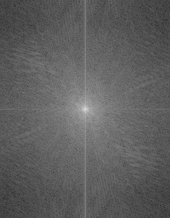
Aunt, log Fourier transform
Me, log Fourier transform
Me low frequency, log Fourier transform
Aunt high frequency, log Fourier transform
Hyrbid image, log Fourier transform
More examples: Using the same sigma and ksize parameters, here is another example, where I aligned two of the greatest tennis players in history. I set Federer to be the low frequency image where one would see more clearly afar, and Djokovic as the high frequency image for close inspection.
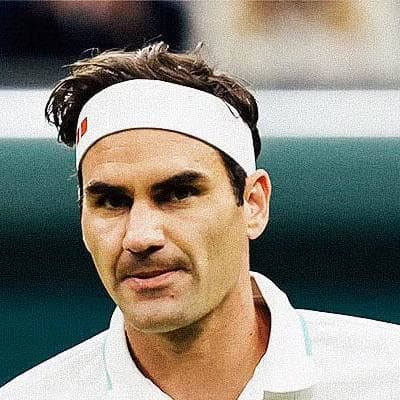
Federer
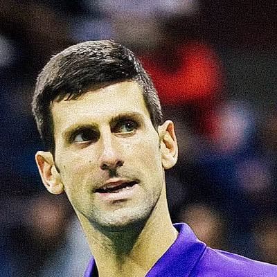
Djokovic

Hybrid image of Federer (low freq) and Djokovic (high freq)
2.2: Bells & Whistles
I only generated the hybrid images with RGB-colors above, and I was curious how grayscale hybrid images would look like. Below are two comparisons of how color channels affect the hybrid effect, using the two sets of images above.
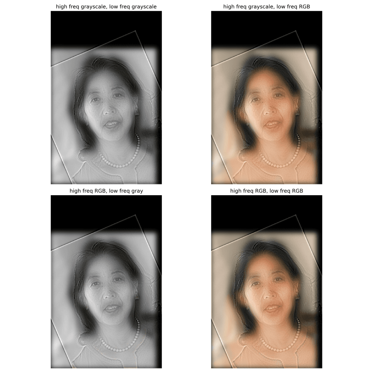
Color analysis of set(aunt, me)
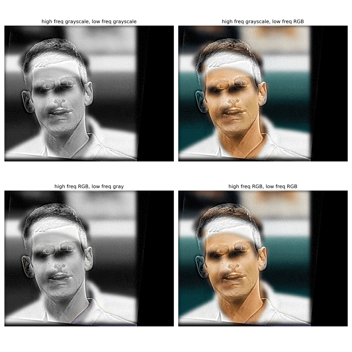
Color anlaysis of set(Djokovic, Federer)
I experimented with different combinations of grayscale and RGB images for the low- and high-frequency components. Based on the results, using an RGB high-frequency image with a grayscale low-frequency image is the least effective hybrid combination. The RGB details in the high-frequency component are usually too subtle for the human eye, making the hybrid appear almost identical to a fully grayscale version. In contrast, using a grayscale high-frequency image with an RGB low-frequency image clearly separates the two frequency components, producing a more distinct and visually appealing effect (in a very subtle way). When the two images have similar color palette, it is really hard to differentiate from both images being RGB-colored, or high frequency image being grayscale, and low frequency image being RGB-colored. So I would say as long as the low frequency image is RGB-colored, the hybrid image would usually yield good visual result.
Multi-resolution Blending and the Oraple journey
In this section, I would blend two images seamlessly following a multi resolution blending as described in the 1983 paper by Burt and Adelson. An image spline is a smooth seam joining two image together by gently distorting them. Multiresolution blending computes a gentle seam between the two images seperately at each band of image frequencies, resulting in a much smoother seam.
2.3: Gaussian and Laplacian Stacks
I created a binary mask right at the middle of the image, and then smoothed the mask with a gaussian filter sigma = 20.
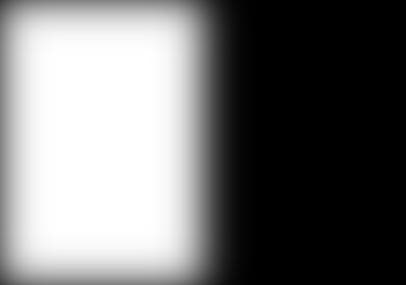
Smoothed binary mask for spline
Using the gaussian and laplacian stack functions I implemented, here is a stack of gaussian and laplacian images of the source images, with max level = 6. For better output image, I omitted the Gaussian stack at level 0 for both images, since they are just the original images.
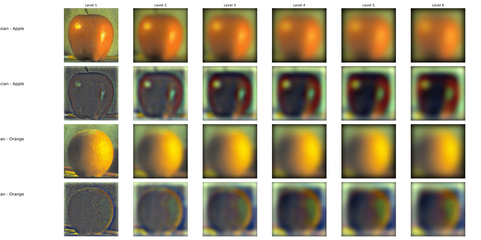
Gaussian and Laplacian stack of Apple and Orange (max_level = 6)
Using the smoothed mask and the stacks above, we can recreate the same figure as Figure 3.42 in Szelski (Ed 2) page 167.
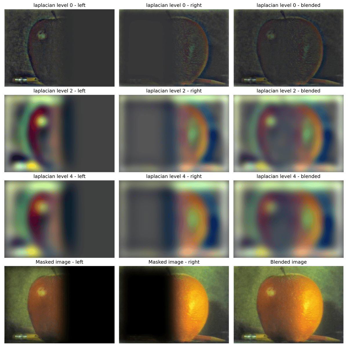
Apple and Organge view
2.4: Multiresolution Blending (a.k.a. the oraple!)
After reviewing the blending mothod described the 1983 paper by Burt and Adelson, below are some examples of multiresolution-blended images I have created.
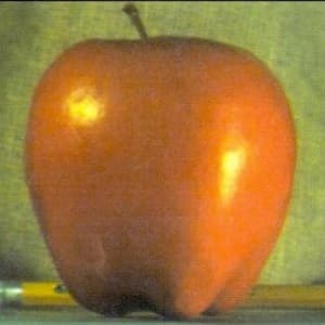
Apple
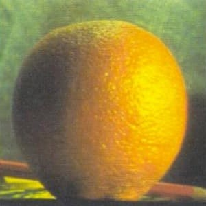
Orange
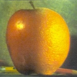
Orple recreated
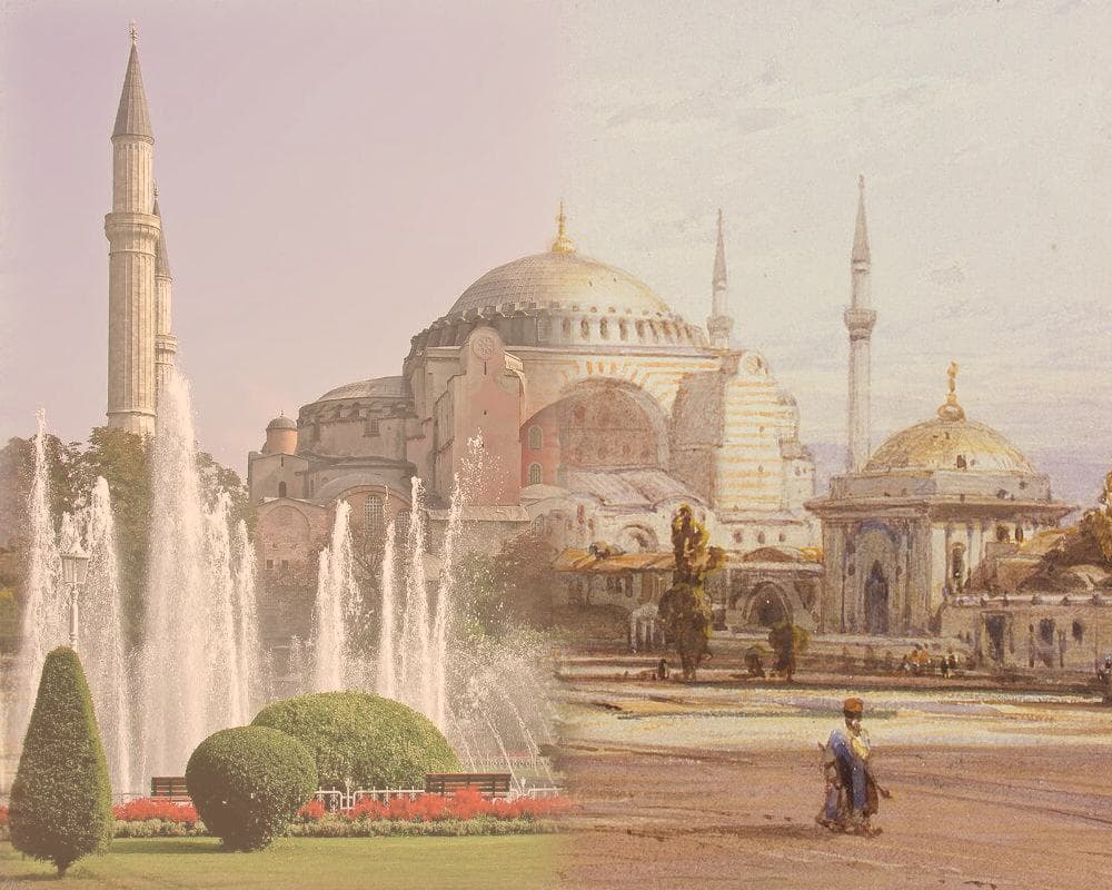
Hagia Sophia Can we use the multiresolution blending method above to blend the artistic world with the reality? Below is my attempt to blend the Hagia Sophia, the epitome of Byzantine architecture, with a painting of it from 1852. A vertical binary gaussian mask is used, smoothed with sigma = 20.
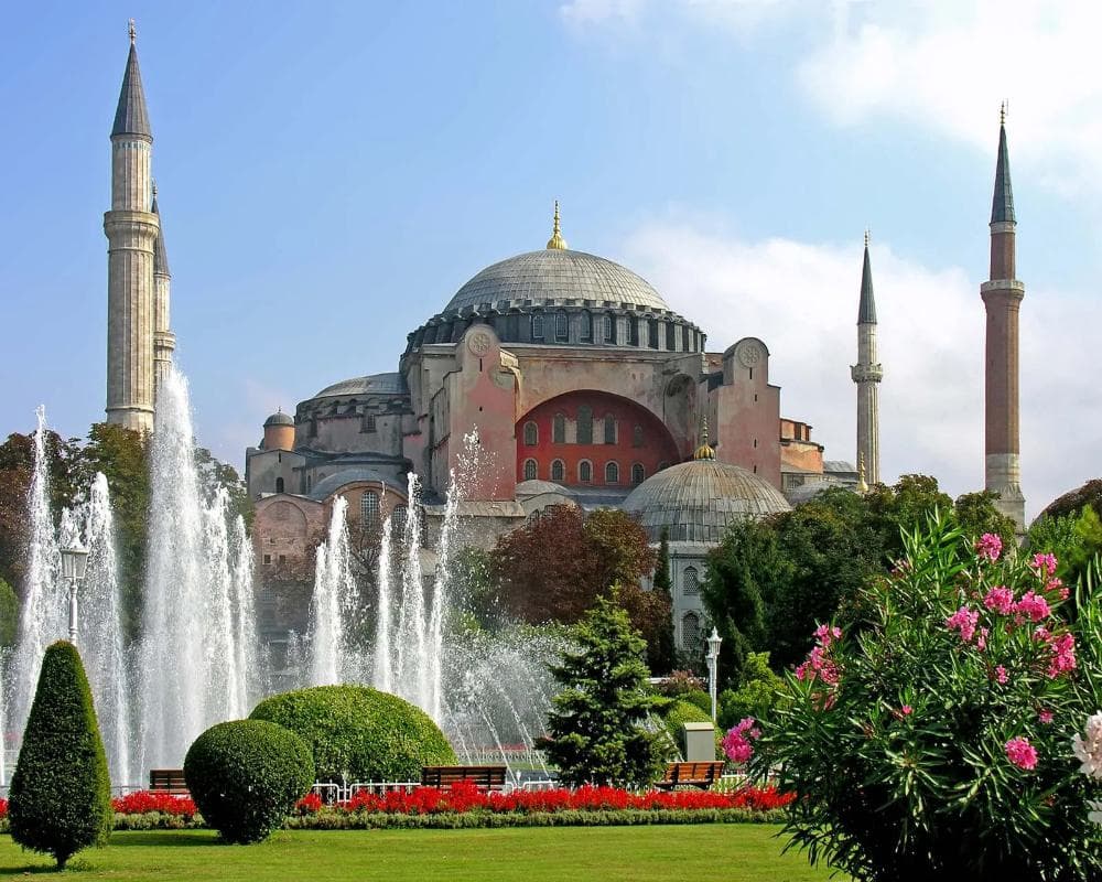
View of the Hagia Sophia (2024)
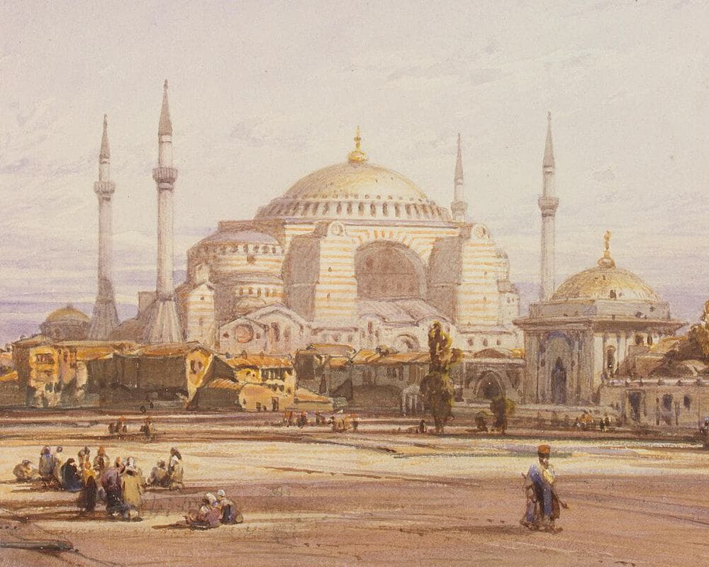
View of the Hagia Sophia in Constantinople by Eduard Hildebrandt (1852)
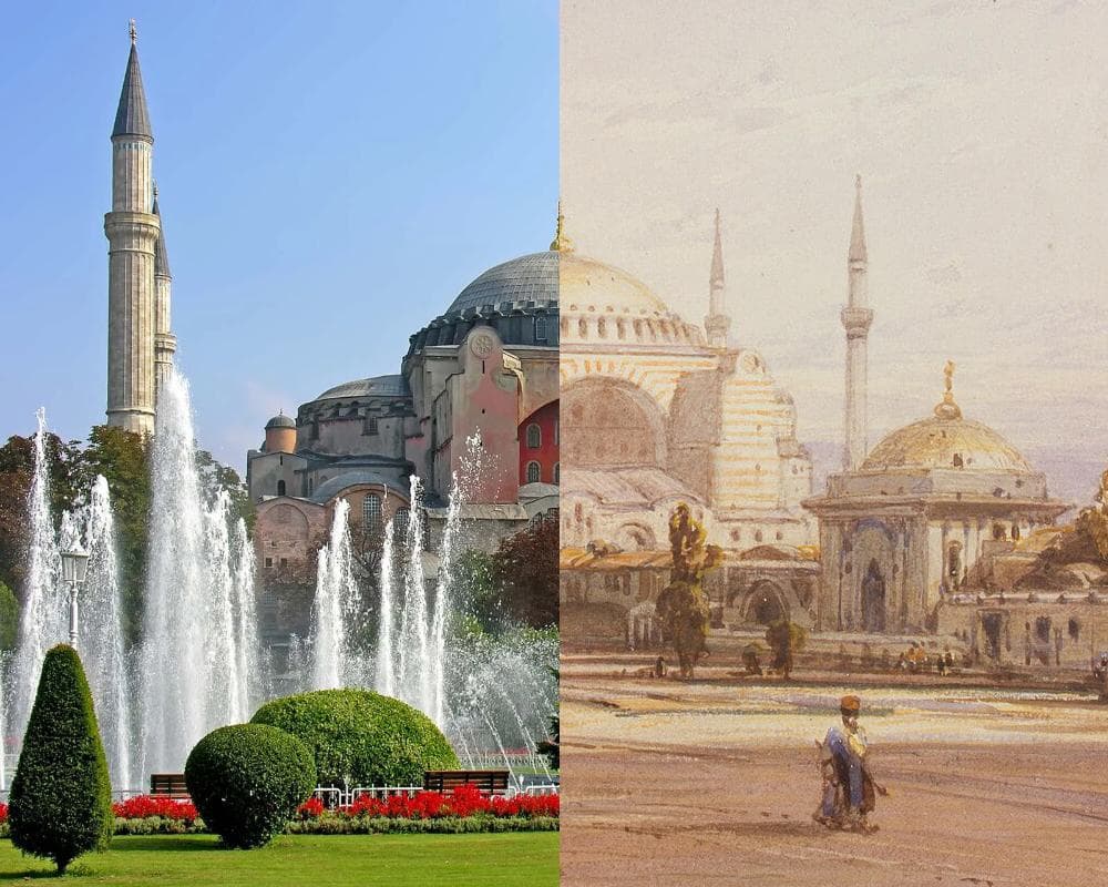
Hagia Sophia, raw spline
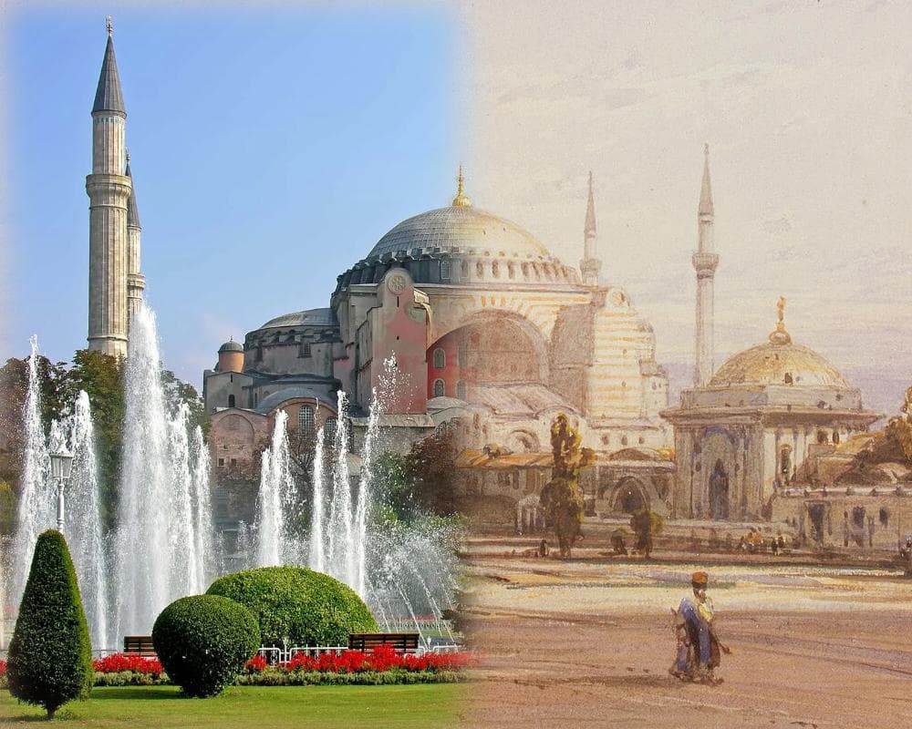
Hagia Sophia, gaussian spline
Blending pizza with nan Here is another example of the multiresolution blending, with a nonlinear binary mask, smoothed with sigma = 20. To achive the best effect, I preprocessed the pizza image by aligning it with one of the nan bread in the picutre.
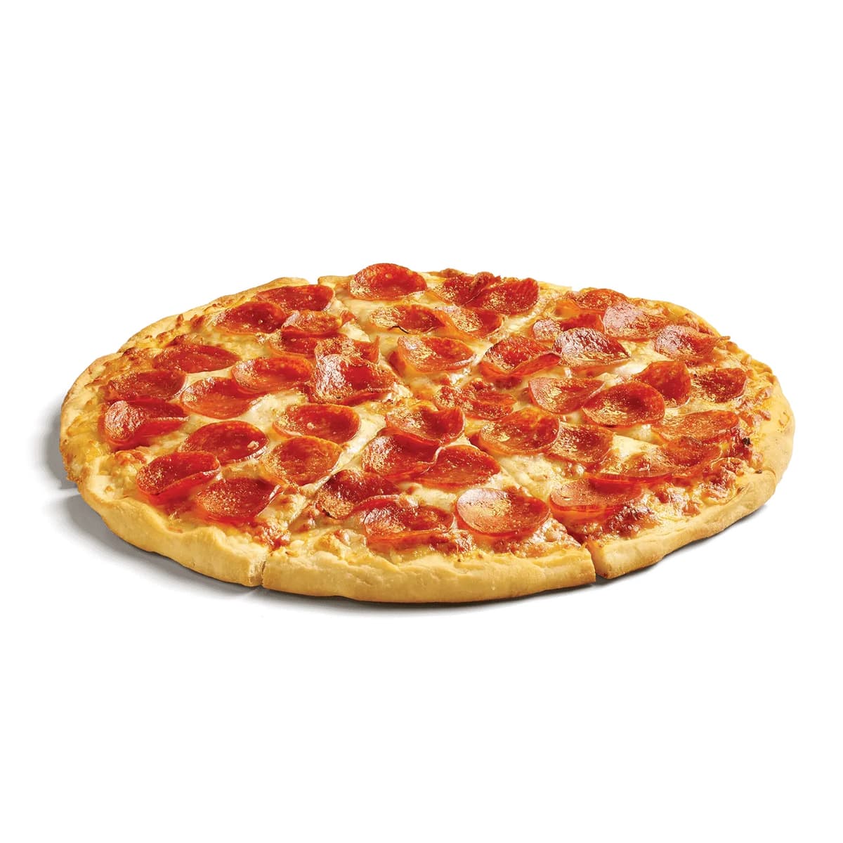
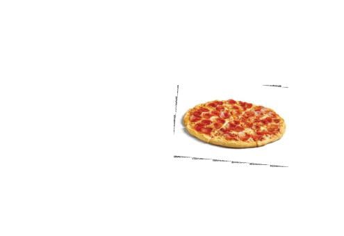
Pizza
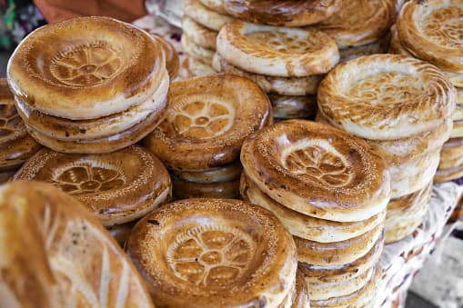
Nan stand in an Uzbek Bazaar
Preprocessed pizza, after roation, recenter, and rescale
Binary mask
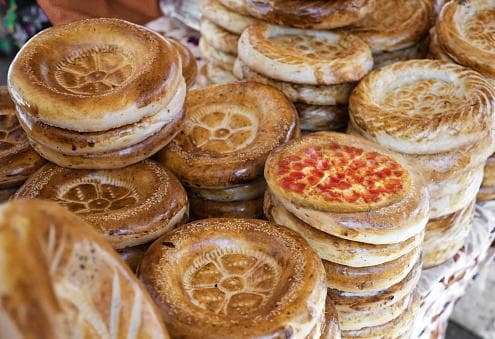
Pizza in a nan stand
The multirevolution blending works here, but this image is not the best example, since the nan bread and the pizza have very similar colors on their blending edges. To challenge myself, I found something more exciting to blend with a nonlinear binary mask.
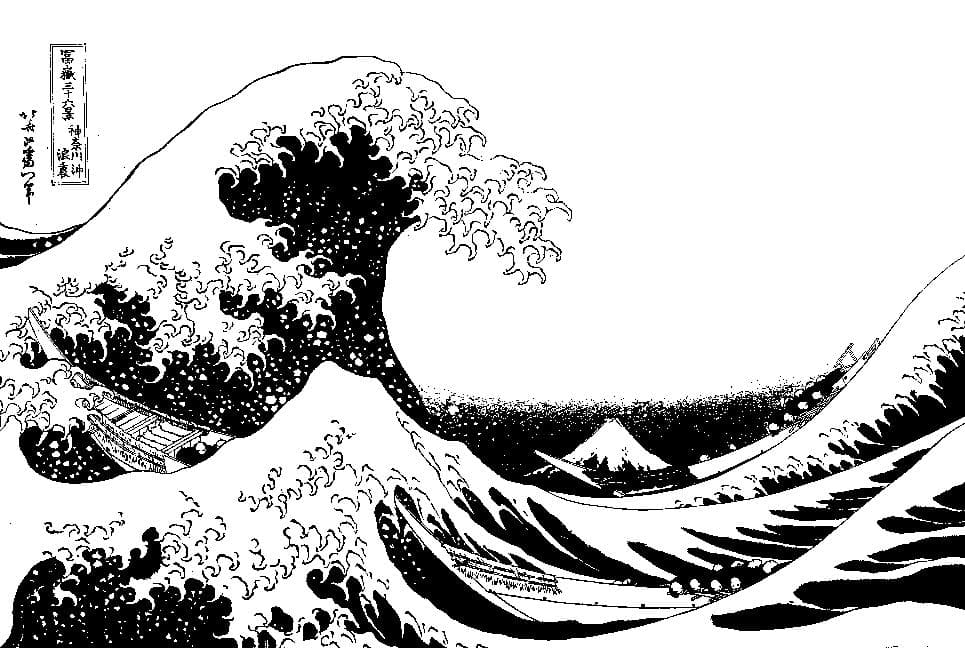
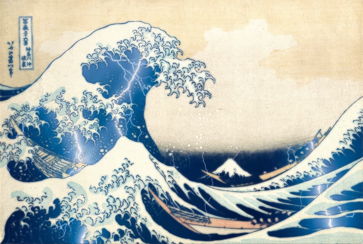
A stormy night at KanagawaI wondered if I could add some weather effect to the Great Waves off Kanagawa (神奈川沖浪裏), one of the most famous Japnaese painting to the western world.
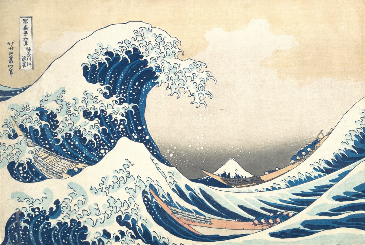
The Great Waves off Kanagawa (1831)
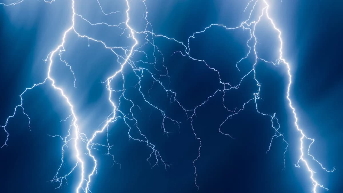
Lightning
I used K-means clustering with 2 clusters to binarize the painting and generate the mask. This mask essentially separates the darker colors in the painting from the brighter ones, and I assigned the sky to be 1 in the binary mask, so that we could apply the lightning effect onto. I used sigma = 10 to smooth the mask.
Nonlinear binary mask generated with KMeans
Binary mask smoothed with sigma = 10
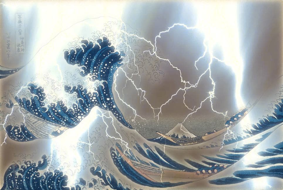
And now we have the blending result, a stormy night on the shores of Kanagawa, with high waves and flashes of lightning illuminating the sky. To make things more interesting, I have also genreated a reverse blending of the lightning waves and clear sky image, using the reversed binary mask in the process.
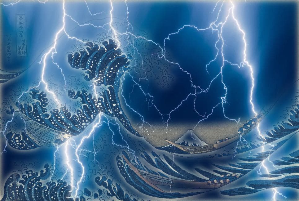
Blended result: a stormy night at Kanagawa
Blended result reserved: lightning waves at Kanagawa
Bells & Whistle
Thought the blend above looks smooth, the colors of the two source images are vastly different that the blending is still very much noticable. Can we make the blend more natural?
Lab color transfer: To make the two visually different images blend more naturally, I applied color transfer from the source to the target image. I first converted the two images from RGB to the LAB space. LAB is a color space defined to express color as three values: L for perceptual lightness and a and b for the four unique colors of human vision: red, green, blue and yellow. Lab is perceptually uniform, meaning changes in its channels correspond more closely to human perception of color than RGB.
Adjust color distribution: I then adjusted the target’s colors to match the overall LAB color distribution (mean and standard deviation) of the source. By matching the Lab statistics, the target image adopts the source’s color palette while preserving its original structures, making the blended result visually more coherent. See below for the blended result:
Hagia Sophia, gaussian spline, no color adjustment
Hagia Sophia, gaussian spline with color adjustment
Adjusting for over-saturation For the lightning image, the LAB color transfer method is not ideal. We would see the lightning past being overly exposed, after the color transfer, runing the visual effect of the image. To enhance the visual effect of this image, I decided to de-emphasize blue hues by specifically reduce their saturations, moving the colors closer to gray and away from the dark blue dominated by the lightning image. I converted the blended image to HSV color space, scaled down the Saturation (S) channel for only blue hues (~200–250 degrees in HSV, i.e., 0.55–0.7 in [0,1] normalized hue), and scaled up overall saturation to make the image more colorful. See below for the improved effect:
A stormy night at Kanagawa, gaussian spline
A stormy night at Kanagawa, LAB color transfer
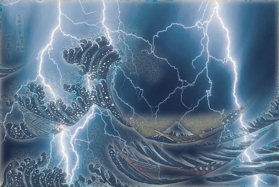
A stormy night at Kanagawa, with reduced saturation